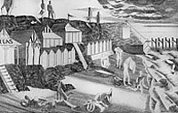
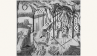
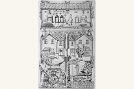
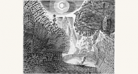
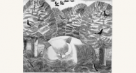
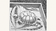
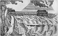
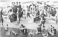
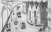
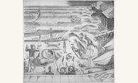
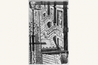
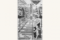
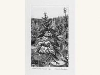
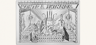
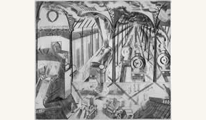
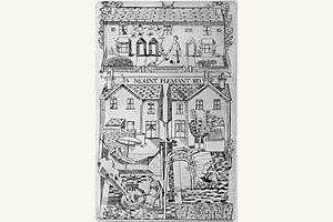
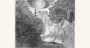
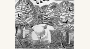
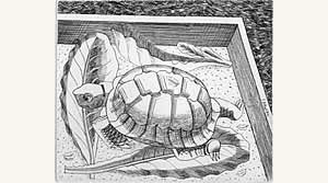
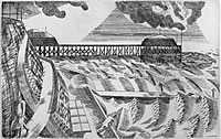
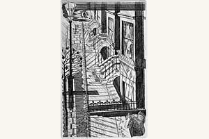
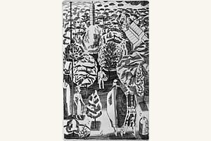
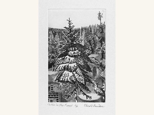
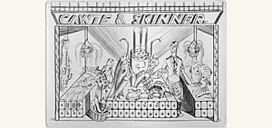
Details
This portfolio of previously little known line-engravings on
copper was published in March 1988 to celebrate the eighty-fifth
birthday of Edward Bawden. The occasion was marked by an exhibition
of the engravings at the Victoria and Albert Museum. Two of them
were subsequently shown in the British Museum exhibition
Avant-garde British Printmaking 1914-1960.
The engravings were published in an edition of 35 copies (+5
artist's proofs). They were printed by Philip Bawden on 300gsm
mould-made paper size 18"x15". Prints are signed, numbered,
titled and dated by Edward Bawden. The set of engravings is presented
in a hand made solander box covered with a Bawden patterned paper
printed at the Curwen Press
There is one remaining complete portfolio available for sale
at £12000.
Reprinted from the catalogue of the exhibition of 15 Engravings
at the Victoria & Albert Museum, 1988
Introduction by David McKitterick
Between 1927 and 1929 Edward Bawden produced, quietly and principally
for his friends, a series of copper line-engravings. He was then
in his mid-twenties, back from Italy after his student days at
the Royal College of Art, and was working in London to meet an
endless variety of commissions. Water-colours and wall-papers
jostled with line drawings and lino-cuts for Harold Curwen's publicity
printing at the Curwen Press, and work with Eric Ravilious on
the murals at Morley College. For all this time had to be found,
as he also began to make excursions into yet another medium, line-engraving
on copper.
Of all his work, these engravings are probably the least familiar.
They were the result of his private interests, not of commissions.
Scarcely any copies were sold, even of the few printed, when six
were exhibited at the St. George's Gallery, near Hanover Square,
in October 1927. Bawden's own records suggest that no more than
forty at most have been printed of even the most popular.
Some of his other engravings, done on commission, were printed
in much larger numbers. In July 1937 one accompanied an article
by Graham Sutherland on 'Graven Images' in Signature which was
then printed in editions of one thousand copies. Two further designs,
executed in about 1952 for the Orient Line, are reproduced in
Douglas Percy Bliss's monograph on Bawden, published in 1982;
another is reproduced in John Lewis's Handbook of Type and Design
(1956). These later engravings' much more finished in some respects
than those of the twenties, bear little relation to his earlier
work. They are relevant to his earlier designs because they show
the way he eventually took forward. Read in that spirit, Bawden's
remarks about line-engraving in John Lewis's book are not without
interest:
Before beginning to work on the plates,
I do a complete shaded pencil drawing of the design. I then make
a simplified tracing, for there is no need to do a detailed tracing
- unless for any reason a facsimile engraving of the original
drawing is required. This tracing I transfer to the plate by means
of ordinary (typewriter) carbon paper.
With this indication as a guide, and with
the original drawing in front of me, I set to work to redraw the
design, mainly with one tool, a square graver about one-tenth
of an inch wide. This turns easily, raising little burr. It is
similar to the tool that would be used for wood engraving, except
that its face is cut at a steeper angle, to lessen the risk of
the point breaking.
When working on a smooth copper plate,
it is difficult to see how the design is developing; so at various
stages I clean the plate with metal polish, leaving the polish
in the engraved lines. This shows up quite clearly, though in
fact, if one lays a piece of tracing paper over the engravings,
the lines are revealed adequately. When the engraving is, as an
imagine, finished, I proof it on a copperplate press, and then,
if need be, re-proof.
If corrections have to be made, fine lines
can be obliterated with a burnisher; more serious errors have
to be planed off with a scraper. This may reduce the surface depth
of the copper to such an extent that the back must be bumped up
and small pieces of paper stuck on the back of the plate, exactly
over the area that has been bumped.
Historically, line-engraving has had a poor press. For centuries,
the wonderful range of possible tones that it offered made it
an ideal vehicle for reproduction, until it was displaced by the
development first of wood-engraving, and then of half-tone and
other photographic processes in the latter part of the nineteenth
century. These new methods were cheaper to prepare and, because
they were letterpress, cheaper to print than engravings.
This essentially subservient role for line-engraving as a medium
to record paintings, drawings, and even other intaglio images
- has often meant relegation to only a very modest place in the
hierarchy of intaglio processes. Not surprisingly, this was especially
marked in the half-century following the development of commercial
reproduction by photographic means from the 1870's onwards. Like
wood-engraving, which was much more directly affected by the consequent
revolution in block-making for printing, line-engraving fell into
disfavour: even acknowledged masterpieces such as the steel-engravings
after Turner's paintings became simply something of the past,
rather than an incentive to the present.
It has taken more than a century for reproductive engraving to
begin to creep back towards respectability, and for its impact
to be assessed. In an article in Signature in 1937, Graham Sutherland,
for one, was scathing:
Engravers, not content to reproduce their own engraved work,
sought fresh fields to conquer in that they attempted to reproduce
drawings and paintings. Both wood and metal engravings have been
at various times prostituted in this way. It is interesting to
reflect that, ignoble as was such an abuse of its original function,
the actual engraving frequently became possessed of a charm and
beauty which all too often the paintings which they sought to
imitate did not possess. No form of engraving was ever meant to
imitate a sunset, still less a painted one; yet so uncompromising
is the medium that, when forced to such an odious duty, it will,
while yielding the effect intended, retain its own inherent beauty!
So, in the early years of this century, those who are now remembered
as intaglio artists concentrated on other processes: William Strang,
Sir Charles Holroyd and F. L. Griggs following Alphonse Legros
on etching; James MeBey, D.Y Cameron and Muirhead Bone on drypoint.
Mezzotints became all the rage for collectors, the subject of
major exhibitions and a still standard monograph by Cyril Davenport
in 1904. Aquatints were the subject of a study, also unsuperseded,
by S.T. Prideaux in 1909.
Much of contemporary taste, particularly in what may be termed
establishment circles, was reflected not only in exhibitions,
but also, perhaps especially, in Arthur M. Hind's great History
of Engraving & Etching, first published in 1908. Hind, working
in the Print Room of the British Museum, was in a position to
be better informed than anyone else, even if he was not so apparently
sympathetic to the work of his contemporaries as was his predecessor
Campbell Dodgson, editor of The Print Collector's Quarterly.
The third edition of Hind's survey was published in 1923, when
Bawden was a student in the School of Design at the Royal College
of Art. As by then the standard work on the subject, Hind's words
had some authority, and he concluded his section on line engraving
with allusions to the two courses which he perceived in recent
developments: one, taken by the Dutch engraver Pieter Dupont,
the other, more adventurous, by William Strang, who had shown
how it was possible to work a plate by drawing the burin towards
one, rather than, more conventionally, pushing it constantly away.
Even for the cautious Hind, the future seemed bright - either
for the conventional or for the unconventional:
There would seem to be a fair field open to the artist who would
return to the medium for original work, whether, like Dupont,
he keeps to the old road, or with Mr Strang, broaches new methods
whose history is still for the future.
More generally, and returning to the theme of his book as a whole,
he closed his work by offering his own assessment of contemporary
themes, the mêlée of
theories and tastes in the years following the First World War
calling for the same conclusion as in 1908:
Engraving and etching have contributed far more than painting
during the past hundred years to preserve the artist from mere
anarchy, and it is in these fields that one looks for the expression,
in which the uncertain streams and tendencies of modem art may
crystallize.
Hind may be forgiven for his specialist professional opinion
of the superiority of one medium over another.
When Bawden entered the Royal College of Art in 1922, there were
separate schools for painting, design, decorative painting, engraving,
and sculpture and modelling. As a member of the School of Design,
he had little to do with the School of Engraving, presided over
by the redoubtable Sir Frank Short. Etching, aquatint, and mezzotint
were equally Short's forte, and in 1911 he had become the first
engraver to be elected an RA. His skills were however not for
Bawden, who failed to impress Short with his drawing ability.
Encouragement and teaching came from elsewhere.
If Hind knew of the work of the French engraver J. E. Laboureur
( 1877 - 1943), he did not show it; yet it was Laboureur's presence
that was most felt in England during the twenties, in a revival
of interest in line-engraving. He was at the height of his powers
as an engraver (his work was by no means limited to the medium)
and at the centre of critical acclaim for those whose horizons
were not limited to etchings or mezzotints. His work became eagerly
collected during the decade, and he was sought after as a book
illustrator - even for illustrations that, because they were intaglio,
were costly to print.
Most of his work was published in France, where there was a tradition
of the 'livre d'artisté', but he also had an informed following
in England. Paul Nash, Bawden's mentor at the Royal College, was
among the contributors in 1921 to The New Keepsake, edited by
X.M. Boulestin and Laboureur himself. Also in 1921, at the instigation
of Stanley Morison, Heinemann published a translation of Jacques
Cazotte's The Devil in Love, with engravings by Laboureur. The
following year Morison, as editor of The Fleuron, commissioned
an article on him by Paul Istel:
M. Laboureur has successfully proved that engraving on copper
and the printed type, far from being irreconcilable, lend themselves
to harmonious association, when the illustrator, discarding the
irregular biting of the etching, is satisfied with the purer lines
of the burin. For the last twenty years, book collectors and publishers,
repeating the Credo of Pelletan, have declared that wood is the
only medium for illustration; exclusively interested in tone values,
in sharp and powerful contrasts of black and white, they have
forgotten that the combination of lines can be as attractive as
the balance of colours.Other articles on Laboureur were less absorbed
with the question paramount for The Fleuron, the tonal relationship
of engraving to printed text. Campbell Dodgson, of the British
Museum, was especially perceptive, and alert to Laboureur's wry
humour, in an article on him in Artwork in 1925, and Yvonne Mareschal
contributed an account of his engravings to Drawing & Design
in 1927.
All this attention both encouraged and reflected revived interest
in an all but discarded skill. Stephen Gooden's consciously archaic
work harked back to the heyday of line-engraving in Britain in
the seventeenth century, most successfully in his illustrations
to the Nonesuch Press Anacreon in 1923. Edward Wadsworth produced
a magical series of line engravings, coloured with pochoir, for
Sailingships and Barges of the Western Mediterranean and Adriatic
Seas, printed by the Curwen Press and A. Alexander & Sons
in 1926. David Jones turned to the same medium for his series
of illustrations to Aesop, published as a type specimen by the
Monotype Corporation in 1928 and, on a larger scale, for the illustrations
to The Rime of the Ancient Manner, published by Douglas Cleverclon
in 1929. Gooden's reputation flowered, but David Jones's work
passed largely ignored or misunderstood, to end up on the remainder
tables a few years later.
This was the contemporary background against which Bawden worked,
in a revival that came to an abrupt end when the depression forced
such expensive books out of the market.
Having received no encouragement from Sir Frank Short at the
Royal College, Bawden enrolled for a course taught by H. K. Wolfenden
at the Sir John Cass Institute, in the City of London. Wolfenden
was a trade engraver, specialising in lettering. Much of his work
was in letter-heads and armorials; an unusually large example
of his work can be seen in the frontispiece to Ambrose Heal's
English Writing-masters and their Copy-books (Cambridge, 1931),
one of several commissions he received thanks to Stanley Morison.
For Bawden, however, Wolfenden had little to offer once he had
taught the technical elements of engraving. The results of this
instruction can be seen in the careful! lettering of 'Mount Pleasant
Road', but generally Bawden preferred to go his own way.
The exhibition at the St. George's Gallery in 1927 was the first
opportunity that Bawden, with his friends and fellow-students
Eric Ravilious and Douglas Percy Bliss, had had to face the public.
Six engravings were exhibited: 'The Jetty Beach', 'The Pier',
'Marine Parade', 'Southcliffe Beach', 'Reverie' and 'Tortoise'.
The event was inspiriting, but the engravings, priced one guinea
and twenty-five shillings, did not sell. The critics - where they
noticed - were hesitant: one spoke of the trio's 'mild and formalised
modernity', a phrase which pleased Ravilious but which shows little
appreciation of Bawden's humour.
He did not exhibit his first engraving 'Cawte and Skinner', a
fishmonger near South Kensington underground station felicitously
renamed for the occasion. Two engravings, unlike the others, are
versions of illustrations used in a book. The two engraved images
of Kew Gardens appear, slightly differently, in Robert Herring's
fantasy Adam and Evelyn at Kew, published by H. V. Marrot and
Elkin Mathews in 1930. The book is illustrated by drawings printed
from letterpress blocks, pochoir coloured in Holland. Unusually,
and perhaps unfortunately, the book was written round the illustrations,
which Bawden drew while a student at the Royal College. Nearly
sixty years later, the illustrations have worn better than the
text. Elkin Mathews was a firm of antiquarian and second-hand
booksellers, whose tradition in publishing was kept alive by Marrot,
a man extravagant alike in his private life and ideas for the
firm. If there was ever any thought of publishing another version
of this book, illustrated with engravings rather than line-blocks,
nothing ever came of such an idea.
Most of the plates are distinctly domestic. They do not depend
on larger literary or pictorial contexts. Characteristically,
the subject matter is often drawn from the immediate surroundings
of Bawden's own houses. 'Redcliffe Road' and 'London Back Garden'
have as their subjects 58 Redcliffe Road, South Kensington, where
Bawden and Ravilious shared lodgings while they were students
and for some time afterwards. 'Mount Pleasant Road' is Bawden's
fictionalised name for Woodfield Road in Braintree, Essex - the
view is of Bawden's family home with his parents in their back
garden. Liverpool Street Station, with its assembled steam engines,
was the link between the two places.
These pictures belong in the same tradition as the watercolours
painted in and around Bawden's house at Great Bardfield, done
a few years later. The five seaside engravings also recall family
life, childhood visits to Clacton on the Essex coast. They are
not views in the conventional sense, but images selected and arranged
as much with an eye to composition as to Bawden's memory. Place-names
were changed, and there is little sign of the way in which Clacton
developed into a crowded seaside resort within a couple of decades
in the early part of this century. In the Clacton plates it is
also especially instructive to compare Bawden's engraved line,
scarcely cutting the surface of the copper in some passages, with
his treatment of similar seaside themes in line drawings overprinted
with colour for the L. N. E. R. booklet East Coasting by Dell
Leigh, published in 1931 .
Other plates draw similarly on Bawden's memory. 'Lane in Moonlight'
was inspired by Bawden's liking for night-time walks in the countryside
around Black Notley, near the grave of the seventeenth-century
naturalist John Ray, whose monument is the churchyard. 'Tortoise'
recalls a pet he had possessed as a small boy. In 'Reverie' is
the unmistakable Bawden image of the cat, omnipresent throughout
his life and work.
Bawden's copper-engravings from this period were a private affair-
private in allusion and private in that few people even knew of
them. They represented a challenge to acquire a notoriously difficult
skill, and the chance to explore the effects possible with an
incised line rather than one drawn with the pen or brush They
are very much records of an artist at work, and are therefore
of especial interest. It is an extra bonus that they date from
Bawden's first years of maturity.
David McKitterick